PDP Optimization for Fashion in 2026: What Shoppers Actually Want From Your Product Page
Stylitics Marketing Team
The Stylitics Marketing Team explores the intersection of AI, retail, and shopper experience, sharing strategies and insights that shape the future of product discovery and visual merchandising.
If you run ecommerce for a fashion brand, your PDP is probably doing more work than the rest of your funnel combined. And shoppers are still telling you it’s not enough.
In fact, only 49% of ecommerce sites deliver a “good” product detail page experience, according to Baymard Institute. That’s not a small UX nitpick. It’s half the industry losing conversions on the page where buying decisions actually happen.
The typical reflex is to just add. Add a richer size guide. Add another review module. Add a styling carousel. Add more descriptive copy about what the item was made with. Watch the bounce rate refuse to move.
We sat with shoppers through two rounds of naturalistic research, watching them buy from their own preferred retailers and from high-coverage PDPs they didn’t know we were studying. The pattern was alarmingly consistent. Shoppers came in knowing what they wanted. They scrolled with intent. And they converted when the next useful thing was already in their path, not buried three sections down.
The 2026 shopper doesn’t need more features. The opportunity is to make what’s already there easier to find. Well-placed recommendations aren’t just a cross-sell mechanism — they’re the feature that can bridge a shopper’s immediate intent and content they didn’t know to look for, making the rest of the PDP work harder in the process. But only when they’re designed to be a time-saver, not an added load.
Below, we’ll walk through what shoppers actually reach for on a fashion PDP, where the existing elements are getting in their own way, and the layout recommendations that consistently move task completion in our research.
Hey Takeaways:
The 2026 shopper doesn’t want more features — Stylitics research found they want the right things made easier to find.
“You May Also Like” and “Complete the Look” were the top performers across every test — the best place to start.
Visibility drives ROI: use bold, high-contrast module headers and dynamic carousels, not gray headers and static grids.
A Forrester study commissioned by Stylitics found AI-powered outfitting drove 6x+ ROI, a 15% conversion lift, and a 10% AOV increase — when modules are seen.
Treat upstream friction (broken search, filters, mobile) as a recommendation-module revenue leak.
Who Is the 2026 Fashion Shopper, Really?
The 2026 apparel shopper enters the year with cautious optimism: spending is stabilizing after a belt-tightening 2025, but value, trust, and efficiency still drive every purchase decision (Salsify 2026 Consumer Research). They’re not browsing endlessly. They know what they want and they’re trying to spend less time searching for it.
Across both research rounds, three personas surfaced consistently — and one of them dominated the sessions.
The Intent + Discovery Hybrid is the one that should reshape your fashion ecommerce strategy. They know what they want but are genuinely open to exploration when the path is obvious and low-effort. This was the most prevalent shopper type we observed in 2026 testing — and the most actionable persona for any product recommendations module strategy.
The Intentional Investor (female, 28–52) shops with purpose. She confirms decisions through customer reviews and fit details. She’s loyal to fashion brands that earn it through consistency and high product quality. She’s also increasingly time-constrained — life-stage shifts (new role at work, taking on a parental role) showed up in session after session as a reason to lean harder on reviews and product recommendations as decision shortcuts.
The Functional Minimalist (male, 22–50) is goal-oriented. He re-purchases favorites. He responds to clear specs, social proof, and friction-free checkout flows like Shop Pay. He will abandon a page rather than work around UX friction.
A PDP optimized only for the exploratory shopper is leaving the majority of traffic underserved. The job is a page that confirms quickly for the efficient shopper while creating natural discovery moments for the one who’s open to them. This is where well-placed recommendation modules earn their place: for the Intentional Investor, a “You May Also Like” carousel reduces the need to navigate away. For the Intent + Discovery hybrid, Complete the Look opens a door they didn’t know was there. The module serves both without asking either to change how they shop.
What Are the Six Design Principles for a 2026 Fashion PDP?
These aren’t layout rules. They’re behavioral principles grounded in how the 2026 shopper actually moves through a product page. Product recommendations sit at the center of all of them. They’re what the rest of the page is building toward, and the principles below are ordered accordingly. They apply to the Shopify Product Page you have today, and they should inform whatever comes next — including any future PDP rethink that doesn’t yet exist.
1. Design recommendation modules to feel like a shortcut, not a detour.
“You May Also Like” and “Complete the Look” generated the strongest shopper engagement, and both work best when they feel like they’re saving the shopper a step rather than adding one. The module type, the theme, the header copy, and the visual treatment all contribute to that perception. In a reimagined fashion PDP, these modules might appear earlier, integrate differently, or take an entirely new form — but the time-saver principle should travel with them.
2. Make every entry point to a module visually impossible to miss.
Gray headers on white backgrounds were consistently overlooked. Visual hierarchy failure and scanning blindness are the mechanisms; high contrast, bold typography, and distinct color are the fixes. Whatever form recommendation modules take in a future PDP, their entry points need to register at scan speed. This is where the Forrester numbers live or die — a 6x ROI assumes the module gets seen.
3. Signal what’s below — don’t assume the scroll.
Shoppers need a reason to keep going, and that reason works best when it’s benefit-led (“see items that go with this”) rather than generic. Whether that signal is a jumplink, a visual teaser, an inline module, or something that hasn’t been designed yet, the principle is the same: earn the scroll, don’t hope for it.
4. Make visual confidence the first job of the page.
Wherever and however product imagery appears, it needs to answer the shopper’s core questions — what does this actually look like, how does it fit, what are the details — without them having to search. High-quality images were the #1 attention driver across every session we observed. In a future PDP, this job might be done differently — through video-first PDP design, a 360-degree view, AR, or AI-generated on-model photography — but the job itself doesn’t change.
5. Let social proof earn the scroll, not reward it.
Customer reviews and ratings were the most reliable trigger for below-the-fold engagement across all test rounds. However a future PDP surfaces social proof — verified reviews, influencer UGC, user-generated content, or shoppable galleries — it should appear early and prominently enough to build trust before the shopper has decided whether to stay. Treat it as an entry point to deeper content, not a footnote.
6. Treat upstream friction as a module visibility problem.
Broken search, incomplete filters, non-interactive mobile elements, and confusing navigation all trigger workaround behavior that pulls shoppers off the PDP path before they ever reach a recommendation module. These aren’t separate UX issues. They’re rec module revenue leaks. Any future fashion PDP concept worth building should consider the full customer journey, not just the page in isolation.
What Does the 2026 PDP Need to Get Right Above the Fold?
Above-the-fold content earns the scroll, and the scroll is what unlocks the rest of the page’s revenue. According to our research, high-quality images were the single most consistent attention driver across every observed session — across all retailers, all demographics, all device sizes. Shoppers engaged heavily with product images that allowed them to zoom into details, especially close-up shots of materials and construction. Imagery isn’t table stakes for fashion brands; it’s a differentiator.
A useful frame for this section is neuroaesthetics — the study of how visual design affects attention and decision-making. Shoppers aren’t being difficult when they skip text or miss a recommendation module. Their brains are doing what brains do: filtering for signals, tuning out noise. Good PDP design works with that pattern, not against it.
What triggers banner blindness, cognitive overload, and selective attention — the failure modes we observed most often — almost always sit in the way of the product itself. Discount pop-ups that interrupt before the shopper has formed an opinion on the item. Promotional banners that compete visually with the product images. Text-heavy descriptions that get skipped over entirely. One tester described a major retailer’s PDP as “clunky and cluttered” — a direct quote and a useful diagnostic phrase.
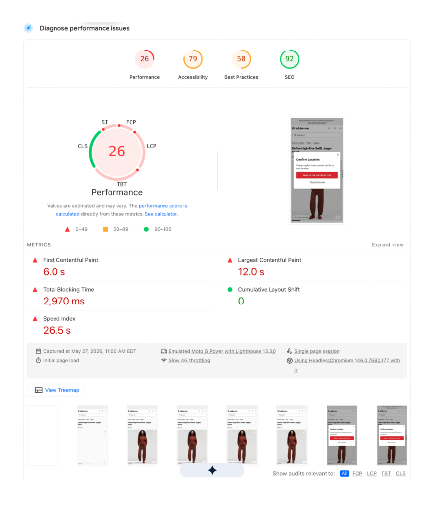
Mobile UX is where this all gets concentrated. With mobile commerce projected to account for 59–60% of Global Traffic in ecommerce sales in 2026 (ConvertCart, Feb 2026; Luigi’s Box, Jan 2026), mobile friction isn’t an edge case anymore. We watched unresponsive elements, slow page load times, and non-interactive product images all trigger workaround behavior — shoppers compensating by moving around the page rather than moving through it. That’s a Conversion Rate Optimization problem that masquerades as a design problem, and it’s exactly the kind of thing A/B testing on a single hero image won’t surface.
A cleaner above-the-fold experience earns trust, and trust earns the scroll. Your product pages’ first job isn’t to close everything. It’s to earn the next step.
How Do Recommendation Modules Become the Connective Tissue of a Fashion PDP?
Product recommendations contribute up to 31% of ecommerce site revenues on average (Experro, Aug 2025) — but only when shoppers actually see and engage with them. Recommendation modules are often placed below the fold, which means they’re only as effective as the design choices that get shoppers there. Done well, they’re not a below-the-fold feature at all. They’re the bridge between a shopper’s immediate intent and the broader value the rest of the page has to offer.
The business case is already solid. A Forrester Total Economic Impact study commissioned by Stylitics found that AI-powered bundling and outfitting modules generated a net ROI of over 6x across a three-year period — increasing ecommerce conversion rates by 15% and average order value by 10%. Those numbers assume the modules are being seen. Our research surfaces what gets in the way of that.
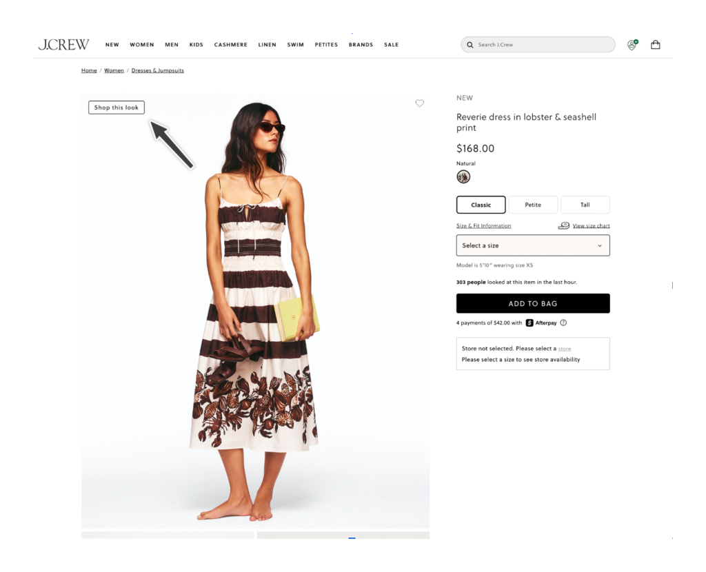
The Jumplink Is the Handshake
A well-designed jumplink above the fold — visually prominent, benefit-led (“Shop this look”) — signals to the shopper that relevant content is waiting without asking them to scroll on faith (Blikket, Oct 2025). It earns the scroll and protects the ROI of the module below it.
Once the shopper arrives at the module, it does double duty. It surfaces something useful and, in doing so, retroactively validates the product the shopper was already considering. “Complete the Look” doesn’t just sell another item. It confirms the first item was a good choice. This is the inspiration-to-conversion moment that Stylitics’ outfitting technology is built around: moving a shopper from “I like that” to “add to cart” by showing them the full picture (Stylitics, Shop the Look vs. Complete the Look).
The consequence of friction on recommendation module visibility is easy to underestimate. When broken search, non-functional filters, or confusing navigation forced shoppers into workaround behavior, they shifted to manual searching and never reached the recommendation modules at all. Friction upstream in a recommendation module is a revenue killer downstream — a shift that’s easy to miss in standard Google Analytics or Shopify Analytics dashboards but shows up directly in engagement rates.
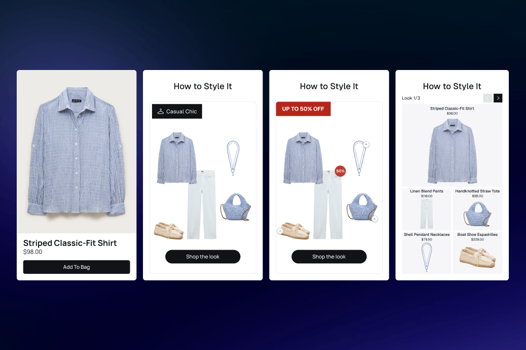
You May Also Like
You May Also Like was the top performer across all tests. It feels low-pressure and contextually relevant — the clearest “time-saver” framing.
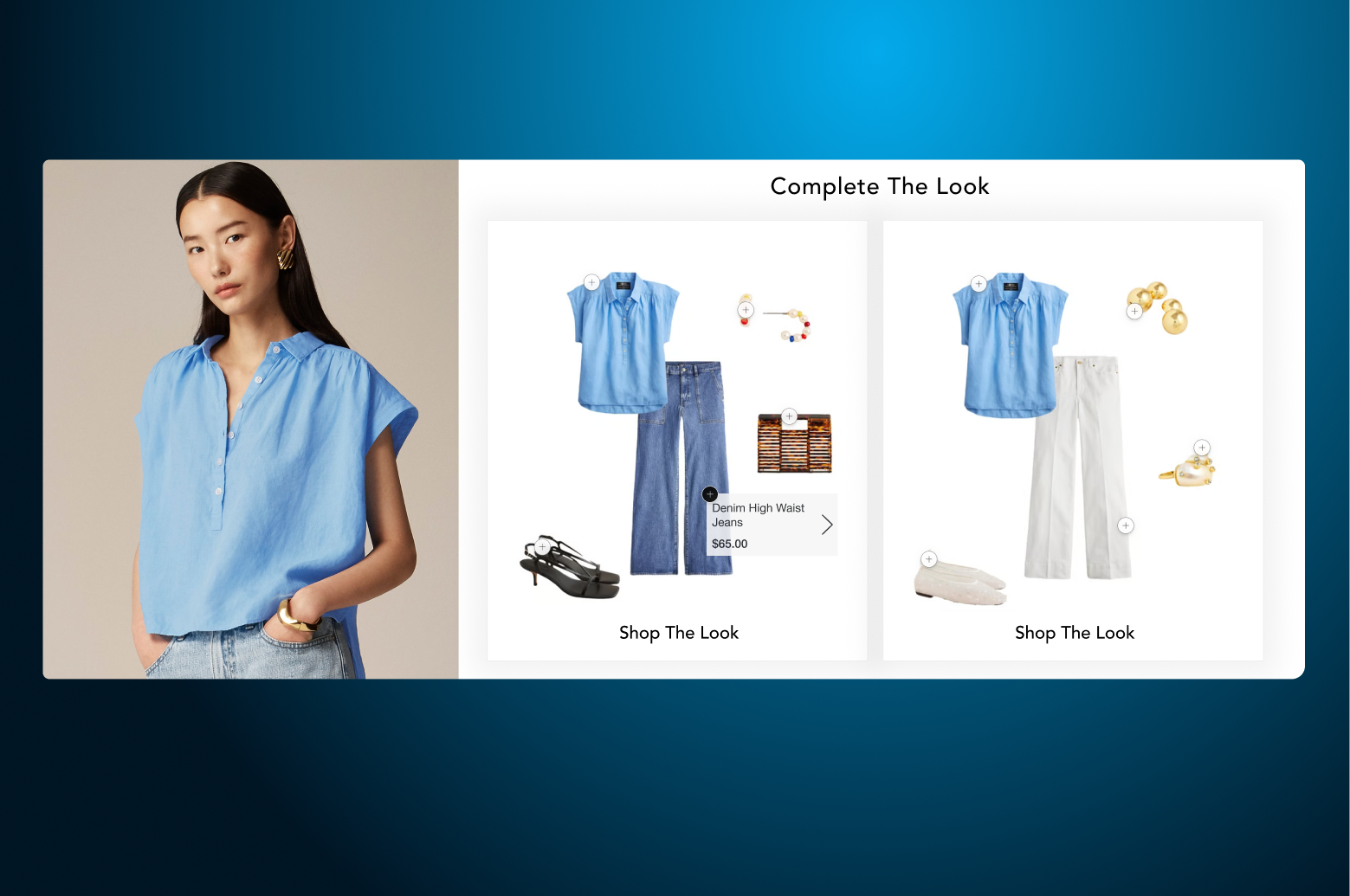
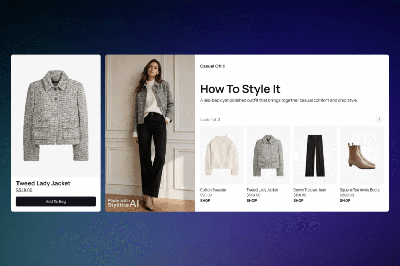
Complete the Look
Complete the Look generated strong expressed interest. The challenge is discoverability, not desirability. It needs placement and contrast to match the enthusiasm it generates. Stylitics’ Complete the Look widget surfaces fully styled, multi-item bundles directly on the PDP — turning a single product into a head-to-toe look with instant add-to-cart functionality, reducing decision fatigue while raising average order value.
What follows is the broader palette of modules worth considering — but think of it as a menu, not a mandate. “You May Also Like” and “Complete the Look” were the clearest winners in our research, and they’re the safest starting point for most fashion PDPs. The rest each earned engagement in specific contexts, with specific shoppers. The only way to know which combination moves the needle for your audience is to test it: your shoppers, your inventory, your traffic mix. Treat the modules below as hypotheses to validate, not a checklist to install.
Here’s the same section with the framing kept but the “Reach for” phrasing removed:
Each of these earns its place by doing a specific job for a specific shopper. The point isn’t to run them all — it’s to recognize which one matches the gap you’re trying to close, then test it.
Shop the Look / Shop the Model
Shop the Look / Shop the Model is the play when your goal is inspiration over efficiency. Where Complete the Look is compact and transactional, Shop the Look uses shoppable galleries and hotspots to immerse shoppers in styled scenarios — occasion-based, trend-forward, and storytelling-led. It’s worth testing when you want to lift basket size by selling a feeling, not just a SKU. Finish Line’s “Top Trending Outfits” and Snipes’ AI-generated streetwear bundles are live examples, and one retailer using Stylitics’ Shop the Model saw a bundle click rate nearly three times higher than standard modules.
How to Wear It / Wear It 3 Ways
How to Wear It / Wear It 3 Ways earns its place when styling uncertainty is costing you conversions or driving returns. This versatility-forward module shows the same product styled multiple ways — casual, elevated, workout — proving product range and giving the hesitant shopper the confidence to commit. PUMA uses this format on PDPs. It speaks directly to the Intentional Investor persona who wants to know a piece will work across contexts before she buys.
Shop the Trend / Featured Shops
Shop the Trend / Featured Shops fits when your traffic arrives with a loose goal rather than a specific item. These occasion- and theme-based discovery modules group products around an editorial concept (“Spring City Commute,” “Event Ready,” “Weekend Casual”) instead of a single SKU, giving the Intent + Discovery hybrid a curated starting point. Stylitics surfaces these through themed carousels that adapt to inventory and live shopper behavior, so the entry point stays relevant without manual merchandising.
Frequently Bought Together
Frequently Bought Together is the dependable, low-risk option when you want a reliable add-on lift. It’s familiar, trusted, and earns solid mid-tier engagement — especially when paired with inventory-aware bundling logic that surfaces relevant add-ons without manual merchandising effort.
Module Themes That Resonated
Similar Items resonated across both test rounds — a consistent top performer regardless of retailer familiarity. Trending performed strongly, especially in assigned-retailer contexts; “Trending” and “Popular Now” labels add urgency and social proof, and Stylitics’ inventory-aware trending logic updates these in real time without manual curation. Occasion framing (“event ready,” “weekend casual”) performed well when browsing familiar retailers. Color is a strong performer for the shopper who filters by palette first, and it works best when color variants and coordinating pieces are surfaced together. Free Shipping as a theme showed moderate interest — a quiet, value-aligned hook that surfaces well for the value-conscious shopper without requiring a discount.
What Makes Shoppers Stop and Engage
Across both research rounds, five elements consistently triggered shopper engagement with a module:
Price incentives surfaced at the right moment in the journey
Color variation options visible at a glance
Stronger, more eye-catching visual design — bolder colors, larger fonts, and high-contrast headers shoppers specifically asked for
Personalized product recommendations that feel relevant to the item already being considered
A clear “see more like this” call to action — direct, benefit-led copy outperformed generic headers
Visual design of the module matters as much as content. Gray module headers do not stand out on scroll — that’s a visual hierarchy failure, insufficient contrast, and scanning blindness all stacked on top of each other. Shoppers requested bolder colors, larger fonts, and higher-contrast headers. One tester asked specifically for a color that “pops” and noted it would increase engagement. Dynamic and interactive formats (carousels, expandable layouts) outperformed static flat grids. Sticky recommendation bars are an emerging design pattern worth considering for high-traffic PDPs (OptiMonk, Sep 2025).
What Bigger Shifts Are Shaping the 2026 Fashion Shopper?
The path to purchase is more fragmented than ever. Shoppers in 2026 discover products through TikTok, social shopping platforms, search results, email, and AI assistants before they ever land on a PDP. The product page is often a confirmation stop, not a discovery destination — which makes product recommendations for fashion one of the few remaining discovery surfaces on the page itself (Salsify, Top Ecommerce Trends 2026; ConvertCart, 2026).
AI-assisted discovery is mainstream now. 22% of shoppers use AI assistants like ChatGPT to research products before purchasing (Salsify 2026 Consumer Research). Intent arrives pre-formed. The PDP’s job is to confirm and extend it, not introduce the product from scratch.
And the ground is still shifting fast. At Google I/O 2026, Google introduced Universal Cart — a single, persistent, Gemini-powered cart that lets shoppers add products from across Search, Gemini, YouTube, and Gmail, then check out with Google Pay or hand off to the merchant’s site (TechCrunch). It’s rolling out in the U.S. this summer, with launch partners including Nike, Sephora, Target, Walmart, Wayfair, and Shopify merchants. Agentic shopping experiences like this — where the discovery, comparison, and even the cart increasingly live outside your storefront — are exactly why the PDP can no longer assume it’s the shopper’s first or only touchpoint. The brands that win will treat the product page as one confirmation point in a journey that’s being reshaped in real time, and design it to extend pre-formed intent no matter where that intent was built.
Shoppers want more control, not more content. A consistent ask across our research was for more personalization tools, better filters, and the ability to shape the experience — not just receive it. Collapsible modules, thematic filtering, and “see more like this” controls are design responses to that ask.
Value and trust remain the foundation. 67% of consumers say high product quality and value are enough to influence brand trust (Salsify, Top 10 Consumer Trends 2026). A PDP that communicates quality clearly — through imagery, customer reviews, and relevant product recommendations — is doing the trust-building work that converts.
The listing page sets up the product page. Shoppers arrive at a PDP having already done significant decision-making through search, filters, and browsing on the CLP. Investing in product listings means shoppers arrive on the PDP more ready to engage — and more receptive to whatever the recommendation module surfaces next.
There’s also the marketing strategy lens to consider. The brands that thread paid ad spend, performance creative, and PDP design into a single user experience are the ones that get disproportionate Black Friday lift. A well-built fashion PDP with the right product recommendations does double duty as the landing destination for paid traffic — which means your ad spend, your Price Optimization work, and your E-commerce Conversion Optimization Strategy all converge on the same product page. Treat Fashion & Apparel eCommerce PDP optimization as a marketing investment, not a UX cost center.
The Technical Foundations Underneath Product Page UX Optimization
The work above is design work. None of it lands without a clean technical base. Google’s Core Web Vitals — particularly Interaction to Next Paint (which replaced First Input Delay in 2024) and Largest Contentful Paint — are now the table-stakes thresholds for organic search visibility. Slow Shopify Product Page templates, image-heavy hero blocks without lazy loading, and bloated third-party scripts hurt both shopper experience and search engine performance.
A short technical PDP checklist for ecommerce teams to run quarterly:
Mobile-first analysis on a real mid-tier Android, not just an emulator
Mobile responsiveness checks on tap targets, image zoom, and sticky elements
Structured data (Product, Review, Offer) in JSON-LD so search engine crawlers can parse it cleanly
Meta descriptions that summarize the product page with a benefit, not the boilerplate
Internal links from PLPs, blog content, and landing pages with descriptive anchor text
Product titles and product data that match how shoppers actually search
Image alt text, file size, and dimensions tuned for both Google’s Core Web Vitals and accessibility
This applies whether you’re on Shopify Plus, Adobe Commerce, or a Headless Commerce setup pulling product data through a Product Recommendations API. The platform changes the implementation, not the principle.
Your PDP Optimization Checklist for 2026
The brands that win fashion ecommerce in 2026 won’t be the ones with the most features. They’ll be the ones where every part of the page is doing its job — and handing off cleanly to the next.
A short, practical checklist to optimize against today:
Imagery answers fit, material, and detail questions at a glance (multiple angles, close-up texture shots, ideally a 360-degree view)
Star ratings and customer reviews are visible above the fold
Pricing, size, and shipping are surfaced without hunting
A benefit-led jumplink signals what’s below the fold (“See items that go with this”)
Recommendation module headers use bold typography, high contrast, and color that “pops”
Module placement uses dynamic carousels, not static grids
Mobile-first analysis checks tap targets, page load times, and image zoom on real devices
Friction upstream (broken search, broken filters) is treated as a rec module revenue leak
The 2026 shopper isn’t harder to reach. They are more purposeful. They know what they want, they respond to quality and relevance, and they will engage with the right features when those features are easy to find and feel like a genuine shortcut. Above-the-fold content earns the scroll, the scroll reaches the recommendation module, and the module — designed as a time-saver with clear visual hierarchy and a benefit-led entry point — completes the experience she was already looking for.
Frequently Asked Questions
PDP optimization for fashion is the practice of designing the product detail page so it confirms the product for purposeful shoppers and creates discovery moments for open ones. It covers imagery, social proof, recommendation modules, mobile UX, and the upstream filters and search that feed it. Only 49% of ecommerce sites currently do this well (Baymard, via Shopify).
Naturalistic research is a study method that observes people in their real, everyday environment doing the actual task you want to understand — rather than testing them in an artificial lab with assigned, contrived tasks. The goal is ecological validity: because the conditions mirror how people genuinely behave, the patterns you observe are more likely to hold true in the real world.
We watched real shoppers buy from their own preferred retailers and from high-coverage PDPs they didn’t know we were studying. They came in with genuine intent — actually wanting to purchase — and shopped the way they normally would. That real context, real motivation, and unobtrusive observation is what makes the approach “naturalistic,” and it’s why behaviors like scrolling with intent and converting when the next useful element was already in their path are trustworthy signals rather than lab artifacts.
Because shoppers behave differently when they’re genuinely trying to buy something they want versus completing a task a researcher handed them. Observing real purchase behavior surfaces the friction points and engagement triggers that an artificial test would miss, and reduces the observer effect, where people change their behavior because they know they’re being watched.
It trades experimental control for realism. You can’t isolate variables as cleanly as a controlled A/B test, so naturalistic research is best used to surface behavioral patterns and generate hypotheses. That’s why we pair it with quantitative sources from Baymard, Forrester, and others, for the hard performance numbers.
AI-powered product recommendation modules, like Complete the Look, You May Also Like, and Shop the Look, surface relevant items at the moment a shopper is most likely to add. A 2024 Forrester TEI study commissioned by Stylitics found a 15% lift in conversion rates and a 10% AOV increase, driven by modules being seen and engaged with (Forrester TEI).
Complete the Look is compact and transactional — a small bundle of 3–4 items added directly from the PDP. Shop the Look is editorial and immersive — hotspot-enabled imagery that lets shoppers explore a full styled scene. They serve different stages of the customer journey and work well together (Stylitics).
Mobile commerce will represent 59–60% of global ecommerce sales in 2026 (ConvertCart; Luigi’s Box). Slow page load times, unresponsive elements, and non-interactive product images don’t just hurt mobile UX — they trigger workaround behavior that pulls shoppers off the PDP before they reach a recommendation module.
Below the fold is fine — but only if a benefit-led jumplink, sticky bar, or visual teaser above the fold signals what’s coming. The module itself should use high-contrast headers, dynamic carousels, and contextually relevant items (Similar, Trending, Complete the Look). Placement and contrast are what protect the ROI of the module.
Conclusion
The 2026 shopper’s wants and needs have shifted, and PDPs need to shift with them. Fashion brands that get PDP optimization right in 2026 will treat product recommendations as inspiring connective tissue — an active, useful network that guides attention rather than one more element competing for it. The difference is neuroaesthetic: a well-designed module works with how the brain filters signal from noise, while a poorly placed one adds cognitive load and drags the shopper down. The brands that win will design imagery, social proof, and recommendation modules to work together as a single shortcut for the purposeful shopper, and as a doorway for the open one.
The thread running through everything here is the same: above-the-fold content earns the scroll, the scroll reaches the recommendation module, and the module — designed as a time-saver with clear visual hierarchy and a benefit-led entry point — completes the experience the shopper was already looking for. By optimizing the PDP to meet shoppers where they want to be, you cut the time they lose to workarounds and let them do what they came to do: actually shop. And it’s work the 2026 shopper will genuinely appreciate.

 Shop the Look Let shoppers buy the full outfit directly from any styled image.
 Styled for You Personalized outfit recommendations based on individual shopper preferences.
 Complete the Look Suggest complementary pieces to round out whatever a shopper is already viewing.
 Shop Similar Surface visually comparable alternatives when a specific item is out of stock or out of budget.
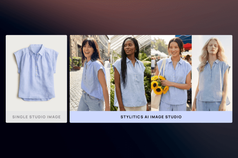
 Flat Lay to Model Choose from diverse models with full control over pose, crop, and framing.
 Background & Scene Swaps Place products in clean studio backgrounds, lifestyle environments, or custom lighting moods.
 AI Colorway Swaps Create photorealistic images for every colorway from a single reference shot.
 Model Diversity & Inclusive Imagery Output-ready formats for PDPs, social platforms, and campaign lookbooks.