Ecommerce Visual Merchandising in 2026: From Filtered Grids to Complete Looks
Stylitics Marketing Team
The Stylitics Marketing Team explores the intersection of AI, retail, and shopper experience, sharing strategies and insights that shape the future of product discovery and visual merchandising.
Retailers spent a decade fixing site speed. As a result, slow page loads now affect just under 11% of sessions, down 20% year over year. Then engagement fell anyway. Time on site down 7%, scroll rate down 2%, and on fashion sites viewed on mobile, content consumption dropped 15%, the steepest decline Contentsquare tracked in retail.
Speed was never the ceiling. The layout was.
Online visual merchandising has spent twenty years imitating a filing cabinet: cut-out product tiles, a rail of filters, infinite scroll. Call it what it is, an inventory browser borrowing the name of a discipline that used to mean something else entirely. In a physical store, merchandising means building a lifestyle around the brand, styled mannequins, adjacency that shows a shopper how a piece actually gets worn. No retailer ever built a floor plan out of 240 identical hangers and a dropdown menu.
Consumer attention is getting scarcer and more expensive by the day. Fixing your online merchandising isn’t about chasing a prettier page. It’s a response to three things landing at once: attention that keeps shrinking and getting pricier, the product grid losing its grip as where shopping journeys start, and a second audience showing up that never looks at a layout at all.
Key Takeaways
Site engagement fell 10% year over year, scroll rate fell 2%, and retail content consumption fell 14% — while slow page loads dropped 20%, meaning performance is no longer the constraint (Contentsquare, 2026).
1 in 3 visits now starts on a PDP, product pages account for ~40% of all page views, and 61% of PDP visits bounce. The category grid is no longer the front door it was designed to be.
80% of ecommerce sites fail to provide three or more thumbnails in product lists, while apparel realistically requires 5–15 images to evaluate — forcing shoppers off the grid to decide anything (Baymard).
AI-sourced traffic to US retail sites grew 393% year over year in Q1 2026 and converted 42% better than non-AI traffic, reversing a 38% deficit twelve months earlier (Adobe, April 2026).
Ecommerce visual merchandising is the practice of composing and placing product imagery across a digital storefront so shoppers can evaluate, style, and buy — spanning PDPs, product lists, on-site search, cart, email, and editorial surfaces. It is measured on conversion, average order value, attach rate, and the return rate, read together.
The working parts, in the order they constrain each other:
Imagery: the assets that let a shopper resolve fit, fabric, proportion, and styling without touching the product.
Composition: whether those assets are shown as isolated objects or as complete, styled looks.
Product data: the attributes that let systems filter, search, recommend, and style.
Placement: where all of it appears: PDP, PLP, search, cart, email, editorial.
Most retailers have invested heavily in the first and fourth and barely at all in the second. That’s the gap this guide is about. For the broader operating discipline around it, see our guide to digital merchandising for retail.
Why is the product grid running out of room?
Because attention is falling while the cost of buying it rises, and the grid’s design assumes an abundance of both.
The 2026 baseline, from Contentsquare’s benchmark of 99 billion sessions across 6,500+ sites: site visits declined 3.8% year over year, conversion rates fell 5.1%, engagement fell 10%, and time on site fell 7%. Retail traffic fell 2.6% and organic traffic fell 4%. Meanwhile traffic acquisition cost rose 9% year over year and 30% over three years, with 59% of sites seeing traffic decline outright.
Mobile is 69.9% of all traffic but converts far worse: desktop converts 74% higher overall, and across every retail sub-industry desktop outperforms mobile by 40–70%. Luxury converts at 1.4% on desktop against 0.9% on mobile. Time per session is 4:46 on desktop versus 2:20 on mobile, and desktop, at under 30% of visits, still accounts for 47% of total time spent.
Put those together and the grid falls apart. Seven in ten sessions arrive on a device with roughly two minutes of attention, land on a layout designed to be scanned and compared at length, and are asked to evaluate dozens of near-identical tiles by squinting at thumbnails. The grid was built for the desktop session that no longer dominates.
Every fashion site’s PLP looks the same because they all made the same choice: neutralize the imagery so the grid stays tidy. That tidiness is what strips out the information a shopper needs.
Is the category page even where journeys start anymore?
No, and this is the finding that should reframe the whole discussion. Contentsquare’s 2026 engagement data shows 1 in 3 visits now starts on a product detail page, PDPs account for roughly 40% of all page views, and 61% of PDP visits bounce.
The funnel the PLP was designed for — home, category, subcategory, product — describes a minority of sessions. Search, social, paid, and increasingly AI assistants drop shoppers directly onto a product page, cold, with no context about the assortment around it.
That inverts the merchandising job. If a third of your visitors never see a category page, then merchandising that only lives on the category page reaches two-thirds of your traffic at best. The surface that needs the composed, contextual, “here’s how this fits into a wardrobe” treatment is the one most retailers treat as a spec sheet. Our breakdown of fashion PDP examples walks through what the better ones do differently.
What does the grid fail to tell shoppers?
Almost everything a shopper needs to decide — and Baymard’s research quantifies the failure precisely.
Across 170+ benchmarked sites and 21,000+ UX parameters, 80% of sites fail to provide three or more thumbnails per product in list views. Baymard’s own testing finds two images is “often not enough,” and that apparel and accessories may require 5 to 15 images for a shopper to evaluate an item. The consequence they observed directly: users were “forced to go to the product page” to view more images rather than being able to decide in the list.
Baymard also identifies four distinct image types shoppers need, each carrying different information: cut-out, in-scale, feature callout, and lifestyle. The typical PLP provides exactly one of the four, and the typical PDP adds a second. The two that answer “how will this look on me, with my things, in my life” are the two most often missing.
Their test session transcripts make the cost concrete:
“I would have loved to see the shoe on an actual foot… sometimes they ride up quite high.”“I don’t think it has it on someone’s back, so I don’t know anything about what size it is.”
Those are not aesthetic complaints. They are the moment before an abandoned session or, worse, a purchase that becomes a return — and with US returns at $849.9 billion in 2025 and 19.3% of online sales returned (NRF), the return is the expensive outcome.
What did in-store visual merchandising always do that the grid doesn’t?
Compose. A store never asked a shopper to imagine the outfit; it built the outfit and put it on a mannequin at the front of the department. The floor set showed adjacency. The window told a story about an occasion. None of that was decoration — it was the merchandising, and it did work the price tag couldn’t.
The translation table most retailers are still missing half of:
In store
Online equivalent
Typically implemented?
Window display
Hero and campaign imagery
Yes
Floor set and adjacency
PLP curation and sequencing
Partially
Mannequin styling
On-model and complete-look imagery
Rarely at catalog scale
Associate suggestion
Outfitting and cross-sell modules
Rarely, or as raw co-purchase data
Endcap and front table
Featured placements, boosted search results
Partially
Fitting room
In-scale imagery, size representation
Rarely
The rows that don’t translate are the rows that carry styling context — the ones a store used to convert browsers into multi-item baskets. Which is why “we have a recommendations widget” isn’t the same answer. Co-purchase algorithms trained on what sold together produce adjacency, not styling; in apparel the difference is the gap between a coherent look and a coat next to a random pair of socks that once shared a basket. We’ve written separately on why frequently-bought-together logic misfires in apparel and on what genuinely good visual merchandising looks like online.
What changes when half your audience is a machine?
Merchandising now has two audiences, and only one of them can see your layout.
The numbers moved fast. AI-sourced traffic to US retail sites grew 393% year over year in Q1 2026, peaking at +1,151% in December 2025. More consequentially, that traffic converted 42% better than non-AI traffic in March 2026 — a full reversal from March 2025, when it converted 38% worse — with revenue per visit 37% higher, time on site 48% longer, and bounce rate 32% lower (Adobe, April 2026). By May 2026 Adobe measured AI traffic converting 54% better.
The window in which “AI traffic is junk traffic” was a defensible position closed inside twelve months.
Meanwhile the discovery surface itself is shifting. McKinsey and BoF’s State of Fashion 2026 reports that shopping-related generative AI searches grew 4,700% between July 2024 and July 2025, that 23% of consumers now primarily use generative AI to discover products, and that traditional search fell from 91–93% of global search volume in 2024 to 74–79% in the first half of 2025. The concrete number for a VP audience: Zara drew 16% of its inbound traffic from ChatGPT between June and August 2025, with H&M and Aritzia at 8% each. Salesforce independently measured agentic search growing 200% year over year as the first step in purchase journeys, while discovery via brand-owned properties fell 7%.
Here is the merchandising implication, and it’s uncomfortable: Adobe found retail product pages score 66% on machine readability — the lowest of any page type, below category pages at 74% and homepages at 75%. Google’s Shopping Graph holds 50 billion listings and refreshes 2 billion of them every hour (Google, NRF 2026). The machine reads your catalog constantly, it reads flat attributes, and it cannot see the styled scene unless the styling is encoded in the data.
Retailers know it. Asked how they’re responding to agentic search, the top two answers were improving product content quality (43%) and optimizing for conversational queries (42%) (Chain Store Age on Salesforce, August 2026). That is a merchandising brief, not an SEO brief — and it runs through catalog enrichment, because attributes like occasion, formality, silhouette, and trend adjacency are what make a product legible to both a shopper and an agent.
What does look-led merchandising look like across the site?
Not one widget. A composition layer that shows up wherever a shopper meets a product.
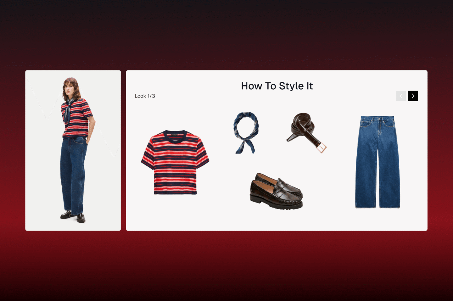
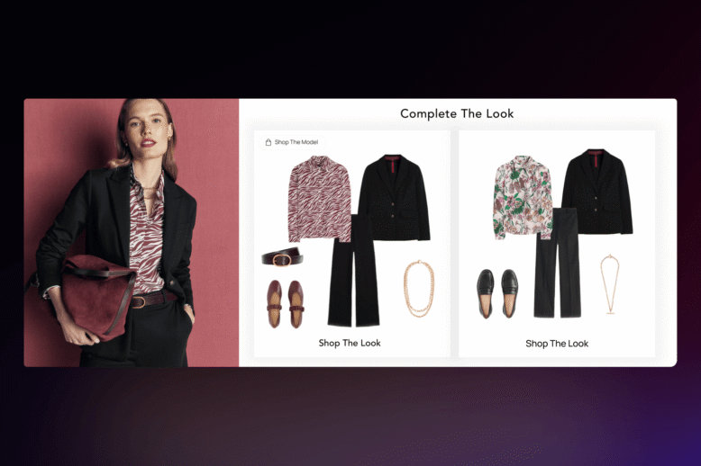
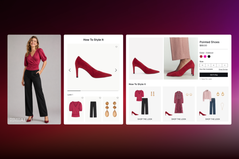
PDP: The highest-leverage surface, given a third of visits start there. Complete the Look answers what goes with the item; Shop the Look and Shop the Model show the assembled outfit on a body, which resolves proportion and scale at the same time. The distinction matters more than most teams assume — see Shop the Look vs. Complete the Look.
PLP: Composed looks placed into the grid break the tile monotony and give the shopper something to react to, rather than 240 variations to compare. This is the closest digital analogue to a floor set.
On-site search: Styling attributes make results relevant rather than literal. Site search enrichment is where most of the quick wins hide.
Cart and email: The look is the natural attach mechanic at both moments, and triggered outfit emails are among the least contested placements left.
Personalization:Styled for You tailors the look off first-party signals, which matters as third-party identifiers keep degrading.
Two enabling layers sit underneath all six. Coverage: styling only works if it exists for the whole assortment, not the top 200 SKUs, which is the point of automated outfitting over manual curation. And imagery: where a photo call doesn’t exist for a colorway or a size range, AI Image Studio generates the on-model asset at roughly 10–20% of photoshoot cost, with fashion-trained human QC on every output.
One caution on control. Merchandisers will not deploy a composition layer they can’t override, and they shouldn’t. Drop calendars, exclusivity windows, markdown timing, and brand standards all require the ability to boost, exclude, and enforce rules without filing an engineering ticket. That’s the difference between hybrid AI and a black box, and it’s the first question worth asking any vendor — including us.
Does composed merchandising actually show up in the numbers?
The honest caveat, which applies to every vendor case study including ours: engaged-versus-non-engaged comparisons overstate impact, because shoppers who interact with outfitting content already carry higher intent. Treat those figures as directional. The defensible reads come from randomized placement tests and period-over-period movement on covered versus uncovered catalog segments — and a vendor who volunteers that distinction is telling you something useful about how they’ll report to your CFO.
How does this differ by category?
The composition problem is the same; the unit of composition isn’t.
Apparel — the outfit is the unit, and colorway and size complexity make coverage the constraint. Outfitting for apparel brands.
Athletic and activewear — the set is the unit; selling the legging alone leaves the top on the shelf. Outfitting for athletic brands.
Luxury — composition must hold brand standards, so merchandiser override is the gating requirement, not a feature request. Outfitting for luxury brands.
Department stores — cross-brand, cross-category composition where no single merchandising owner spans the look. The hardest case, and the highest ceiling. Outfitting for department stores.
Home and furniture — the room is the unit, and “shop the room” is the direct analogue of shop the look. Outfitting for home brands.
How do you measure ecommerce visual merchandising?
With a paired set — one conversion metric, one basket metric, one returns metric — read over full purchase-and-return cycles. Optimizing conversion alone can raise the return rate and shrink contribution margin, which is how merchandising programs get celebrated in Q2 and defunded in Q4.
Styling coverage. Share of active SKUs with a complete, in-stock look attached. The leading indicator, and the one most programs skip.
PDP-entry performance. Since a third of sessions begin on a product page, segment those sessions specifically. Did composed pages hold shoppers who arrived cold?
Attach rate and UPT. Conversion says the product sold. Attach rate says the merchandising sold the look.
AOV and revenue per session. The basket metrics the program is actually funded on.
Return rate by reason code. Fit and “not as pictured” are merchandising diagnostics, not logistics problems.
Machine readability and AI citation share. New, and increasingly load-bearing. Adobe’s page-type scoring gives you a benchmark to aim at, and tracking whether product URLs surface in AI assistant answers is now part of the merchandising scoreboard.
Report upward on contribution margin rather than traffic quality. A 3-point AOV lift plus a 2-point returns reduction beats a much larger conversion headline once the returns line is on the same slide.
FAQs
The practice of composing and placing product imagery across a digital storefront — PDP, product lists, search, cart, email, and editorial — so shoppers can evaluate, style, and buy. It’s measured on conversion, AOV, attach rate, and return rate together, and it differs from in-store visual merchandising in that every decision is testable and every gap is visible in analytics.
In-store visual merchandising sells through fixtures, windows, and floor sets, measured on sell-through per square foot. The ecommerce version works through imagery, product data, and algorithmic placement — and carries a metric the store never did: the return rate.
Attention and layout moved in opposite directions. Engagement fell 10% and retail content consumption fell 14% year over year, while mobile — with roughly two minutes per session — now carries 69.9% of traffic. Meanwhile 80% of sites still don’t show three or more thumbnails per item in list views, so shoppers can’t evaluate anything without leaving the grid.
Yes, but less than the org chart assumes. One in three visits now starts on a PDP and product pages account for roughly 40% of all page views (Contentsquare, 2026). Merchandising that only lives on category pages misses most of the traffic.
They add an audience that reads product data instead of viewing layouts. AI-sourced retail traffic grew 393% year over year in Q1 2026 and now converts better than non-AI traffic, but retail product pages score just 66% on machine readability — the lowest of any page type. Styling has to be encoded in attributes, not only rendered in a widget.
The mechanism is well supported even where a single clean percentage isn’t. Baymard finds 23% of sites don’t show products on human models and 37% lack in-scale imagery — the two asset types that resolve fit and proportion. With 19.3% of online sales returned in 2025 (NRF), closing that expectation gap at the PDP is a margin lever, not a design preference.
Three things: catalog-wide styling coverage rather than hero-SKU curation, product attributes rich enough to style on (occasion, formality, silhouette, season), and merchandiser control to boost, exclude, and enforce brand rules without engineering.
See it on your own catalog
Bring a season’s assortment and Stylitics will show you what composed, look-led merchandising looks like across your PDPs, product lists, and search — with your merchandisers in control of the output. Request a demo.



 Shop the Look Let shoppers buy the full outfit directly from any styled image.
 Styled for You Personalized outfit recommendations based on individual shopper preferences.
 Complete the Look Suggest complementary pieces to round out whatever a shopper is already viewing.
 Shop Similar Surface visually comparable alternatives when a specific item is out of stock or out of budget.
 Flat Lay to Model Choose from diverse models with full control over pose, crop, and framing.
 Background & Scene Swaps Place products in clean studio backgrounds, lifestyle environments, or custom lighting moods.
 AI Colorway Swaps Create photorealistic images for every colorway from a single reference shot.
 Model Diversity & Inclusive Imagery Output-ready formats for PDPs, social platforms, and campaign lookbooks.